Monday, January 30, 2012

Figuring out fonts

I'm quite font obsessed.  I love making art from simple sayings in a really cool font.

It's really frustrating when I see a font I fall in love with and then spend the next 3 hours on fontspace trying to match it I can't figure out the font.  I've had this issue with calligraphy fonts I've seen on invitations and unusual script fonts I've wanted to use.

I came across this website {whatfontis.com} that will let you upload an image and then will give you a list of possible fonts.


{1} First, I typed up some text I wanted to test out.  You could easily scan in an image of text you want to figure out.


{2}  The next step is to go to whatfontis.com and upload the image of your font.


{3}  After you upload, the site will try to decipher the text from the picture you uploaded.  There are instructions on the page, but basically I chose the letters that were most distinct so the site would have an easier time figuring out the font {read the TIP at the bottom of the page too for an explanation}. At the bottom of the screen I also chose to display only results for "free fonts" because I didn't want results returned where I would have to pay for a font when I got the right one.


 {4}  Here are the results returned.  My test font is one of my favorite free old typewriter typefaces - My Underwood.  The site found it correctly and it was in the top three results - cool huh?


TIP:  when you're doing my step #3 above, be sure to pick the more unusual letters {the ones with unusual serifs etc.}  If the font looks just like Times New Roman except the S, J and V's have really unusual flairs on them - pick those letters in step #3.  Why?  If you don't distinguish the font with the unusual letters, you'll get 100 results back that all look just like Times New Roman and you'll be scrolling all day trying to find the one with unusual S, J & V's.  Trust me, I did this the first time and my test font was MUCH lower in the results list when I chose any letter.

Friday, January 27, 2012

The Friday 5 - vintage letters


{1} Letters from a 1900's marquee


Source: etsy.com via Emily on Pinterest


I'm totally smitten with vintage letters - porcelain, metal, rusty, whatever.   

They're great to display alongside your books, on a mantle, or hanging in your living room or bedrooom. 

Here are a few of my favorites this week...


{2} Lovely porcelain letter found on eBay
Source: ebay.com via Emily on Pinterest


{3} I love how the bulbs were removed from this sign.  How perfect would this be in a kitchen?

Source: etsy.com via Emily on Pinterest


{4} Great 10" high metal letter  I love the patina on this one!


{5} I've always been partial to wood block letters.  So many variations and fonts.  I love this display of zzzzz - how great would this be in my bedroom?
Source: etsy.com via Emily on Pinterest


Wednesday, January 25, 2012

Digital collage basics {making transparent images}

Earlier this week, I posted a tutorial {and craft fail} for my fish canvas project.  I've had a few comments in the past on the blog, asking about how to make digital collages.

The fish canvas project was a good simple project to share because it used a limited number of images and used a black and white image with a colored image.

I figured I'd post a few tips on how I create and layer the images in Photoshop Elements and MS Publisher.  I had a heck of a time figuring this out, so hopefully it helps someone out there.


{1} Open Photoshop Elements.  Click File > Open and select your copyright free image {shown below}.

{2} For Adobe Photoshop Elements users, use the magic wand tool {the one with the yellow star at the end of the wand} to select the white background aka what you want to get rid of.  {Tip: if the graphic has a pretty distinct colored background, a tolerance of 50 usually works for me. I check the anti-alias, contiguous, and sample all layers buttons as shown below.  If you have a background that isn't as distinct or a patterned background, you'll need to play with these levels, or else you may be selecting too much or too little of what you want}.  The only difference between this image and the one above is that this image has dotted lines around the fish, showing that the white background is selected.  


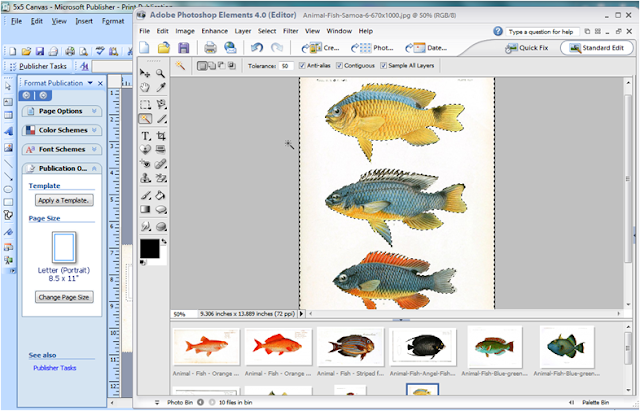
{3} Lots of steps in this one, so pay close attention..I then go to Select > Inverse {to select the fish now since that's what I'm interested in}.  I then go to File > Copy {which puts the colored fish portion on your clipboard}, then File > Paste > New Document {to start a new document with just my colored fish}.  When the new document pop up box comes up {see below}, you're going to want to make sure "Background Contents" at the bottom is set to "Transparent".


{4} Here is what your new file will look like.  You have just pasted the image part that you want in to a new file and the background is clear which means you can now layer images as you please...but only if you do a few more things, so keep following along...


{5} OPTIONAL:  It's a little tough to find projects where I'm going to want all three fish in this plate together.  So to increase my options for layouts, I break apart plates that have multiple images in each scan, and save them separately.  Using the crop tool, select the fish you want and crop close to it.  Click the green check mark when you're ready.   Your file will now just show the one fish with a transparent background {sorry no picture of a single fish}.


{6} It's important that you save your new file as one that is compatible with transparency.  At this point, if you save your painstakingly created transparent image file as a .jpg or .bmp, you're going to end up with a white background.  So, go to File > Save As.  Choose a file name, and then in the drop down, select .PNG.  This file format will preserve your transparent background.


{7} Repeat this process for all graphics you want to use in your project.  Now open your graphics editing program {I like MS Publisher for some reason, maybe because I'm not an Adobe Photoshop Elements expert}. Insert all the images you want to use and begin moving them around on the page, on top of each other {use the "bring to front" option to get an image in front of another one}, etc.  Don't forget that images look really nice and more realistic if some graphics are half on/half off the page.

Here is a really simple two image layering I did for the fish canvas project.  I put the script graphic in the back and centered my transparent fish graphic on top.  The finished fish canvases are back at the top of this post.

I know there are probably better ways to create these images and better software, but this is how I do it, using cobbled together instructions from the Internet and some of my trial and error techniques.  If you have any tips, please leave me a comment!


Tuesday, January 24, 2012

Fish on canvas project


Okay, so I thought I'd post this tutorial a few days ago.  Why not you ask?  Because I had a major craft fail on this one and had to rethink the project.  So here goes the story...

I've been itching to do a project using these fish prints from Oceania and Samoa I found.  The images are from 1906.  For the background, I used a flourished pen image from The Graphics Fairy.  I was thinking of using an encyclopedia page or newsprint background, but I surprised how the script became so graphic and abstract when blown up on my computer.

For this project, I'm using some 5"x5" canvases I had lying around {shown below}.  I had painted them blue, then green, then back to the nice white shown {that's what causes my craft fail, so heed my warning and just use untouched canvases for this project}.  {Tip:  if you're buying canvases that are stapled, look for staples on the BACK of the frame.  There are some inexpensive versions that staple on the edges --- unless it's going in a frame or you cover the sides, you'll see the staples}.


{1} First, scan in your image or find and save your copyright free image to your computer.  Open that file in your graphics editing program and remove the background, making it transparent {everything except for the fish}.  {see below}  {I'm posting the specific instructions for how I create transparent images in Adobe tomorrow if you need that info. {CLICK HERE}}


{2} In a graphics program, as shown below, layer your transparent graphic on top of the Graphics Fairy flourished pen image.   {You obviously need to take in to account the size of your canvas.  Just account for the canvas top, not the sides, I'll explain why later}.  When you're happy with the results, print the image out on Avery t-shirt transfer paper {shown below}.  {Tip:  I use the kind for light t-shirts which is a clear background instead of a white background}.


{3} Cut out your transfer to size.


Now here's the craft FAIL:  I'd seen a technique on Pinterest where the person used the same transfer sheets I'm using and ironed them on the canvas.  She however had NOT painted the canvas.  So after I applied pressure and ironed....THE PAINT MELTED!  The smell was terrible and it looked even worse.  After shouting a few "wow, really? really?" 's   I took a deep breath and decided to regroup...


{4} So then I cut out some scrap fabric {enough to cover the front and wrap around the sides}.


{5} Put the transfer face down & center it.  Iron according to the directions.  Gently peel back the transfer paper {shown below}.  {Tip:  it's best to wait a few seconds after ironing before trying to pull off the transfer paper backing.  If you pull when the paper is very hot, the transfer may not adhere to the fabric or the paper backing and you'll have trouble getting it to stick back down}.


{6} Wrap the fabric around the canvas.  I used matte Mod Podge to glue it down.  I also used the matte Podge over the front transfer part too.  {You know how I said make sure your image transfer only fits the top of the canvas, not the sides too?  Well I'm glad I did it this way, because it was MUCH easier to wet the fabric sides with glue and apply pressure with my fingers than deal with a more rigid transfer on the sides and try to fold that down}.


{7} I then let my canvases air dry on top of a cup.  Notice how they look wrinkly on the surface?  I thought I had another craft fail on my hands!!!  Thankfully when they fully dried the front dried without wrinkles!


Here is a closeup of four of the canvases.  I love how the vintage script looks so abstract.  It was hard to remember that they were actually script letters and not some cool pattern.  The fish really seem to pop.  I can't believe that these fish were from 1906 --- not that I didn't think they had color back then, but I guess I didn't think they used such vibrant colors in their fish studies.


Here are my five finished canvases!


Thanks for stopping by!


I'm linking this project up to:

UndertheTableandDreaming

Home Stories A2Z


Saturday, January 21, 2012

Message in a bottle

{source}
What's better to count down the days until Valentine's Day than a message in a bottle each day for your sweetheart?

All you need is a small bottle with a cork and a small piece of paper.  Write a special message on the paper and stick in the bottle.  Then place in a spot your loved one will see it.

You can also embellish the bottle or write your message in a neat font, but I like the simpler, handwritten version myself.

I found a bunch of these a few months back at Anthropologie.  At $16 each, I thought that was a little crazy.  You can certainly make this for literally less than $1 per message.

Save-On-Crafts has a bunch of options for the bottles.  There are several lots of 12 where each bottle is less than $1.  Also try your thrift stores and craft stores.

I snapped this picture on my phone of an example I saw while I was in the Anthropologie store.  I love how they used some twine to wrap the message.  It makes the paper more compact and easier to remove from the bottle.


Nothing like a daily love note washing up on your bedside table each morning!

{source}


Friday, January 20, 2012

The Friday 5 - Vintage Dress Forms


A picture I took for The Lucketts Store Design House.


I'm totally in love with dress forms this week for some reason.  I pinned a bunch to my Pinterest account.

From time to time, we get vintage dress forms in the shop.  Usually they're in the $200-$600 range, but lately, they just haven't been getting many in.

I found out that even for experienced treasure hunters and pickers, THEY are having a tough time finding these nowadays.  So of course, where do you go when you can't find what you need?...the internet!

I scoured around and found a few favorites out there, but they're mostly early 1900's versions and many easily  ranged from $750 and up.  Here are the results of my labor...enjoy and have a great weekend!


{1} Late 1800's version found on eBay for, gulp, $1,000!  This one is 54" tall and came from an estate sale in Ohio.
{source}

{2} This one is early 1900's.  It stands 4' 6" tall with a 21" round skirt and costs $795.
{source}


{3} Not sure of the era on this one, but another example of a cage dress form.
{source}


{4}  This one extends to 43" tall.  I love how the photographer offset the form in this picture against that dark concrete wall.  Pretty!
{source}


{5} These are really exciting....well to me anyway!  Here is a pair from France circa 1750!  These are still available from Coup d'Etat in San Francisco.  One is listed as 6' 2" tall and the other is 6' 6" tall.  No price listed for the pair, I can't imagine...
{source}

Have a lovely weekend!

Thursday, January 19, 2012

Love letter pillows

It's pretty rare that anyone gets a handwritten love letter anymore.  Or maybe it's just because I've been with the same person for 13 years now that we mostly bond on the couch watching TV now  : )
One of the things that I love about looking through old letters and postcards is the handwritting ---- combine that with the rarity of an actual handwritten love letter today and enter the love letter pillow.

These are such a fantastic way to immortalize a love letter {either yours or someone else's} and the graphic script adds such a nice design element.

{source}

If you want to create your own handwritten text, you can either have a photocopy of a your own handwritten letter and then transfer that on a pillow {flip the text first}, or there are several good fonts that are based on handwriting.  Sorry I didn't have time to put in pics of each {maybe later}, but here are the quick links to some of my favorites:
  • Jenna Sue - a more casual, younger looking script handwriting {link}
  • Otto - a more traditional, older looking script handwriting {link}
  • Bernard - a traditional looking script {link}
  • Brown Bag Lunch - a heavy looking print that looks like marker {link}


Wednesday, January 18, 2012

Sweets for your sweet

{source}
This cute idea is from a few years back, but I've saved it for a few reasons, 1) it reminds me how to print out gift bags using my home printer, 2) it reminds me brownies can come in other shapes besides squares & rectangles, and 3) it's a cute idea for a teacher, coworker, or loved one gift for Valentine's Day.

Pop on over to Twig & Thistle for the full tutorial, including how to make the heart shaped brownie.  I'm sure anyone would love to receive a sweeeet gift like this one.
Related Posts Plugin for WordPress, Blogger...